
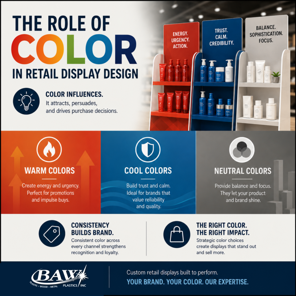
Color is one of the most powerful tools in retail, and one of the most underestimated. The colors used in a retail displays influence how shoppers feel, how long they linger, and whether they make a purchase. Understanding the psychology behind color can help brands make smarter, more intentional decisions when it comes to designing displays that truly perform on the retail floor.
Walk through any retail store and color is doing more work than most people realize. It is guiding your eye toward certain products, setting the mood of the environment, and quietly influencing your perception of brands and the decisions you make as a shopper. For brands investing in custom retail displays, color is not just a design choice, it is a strategic one.
According to a peer-reviewed study published in the journal Management Decision, people make up their minds within 90 seconds of their initial interactions with either people or products, and between 62 and 90 percent of that assessment is based on color alone.¹ That is a remarkable finding, and it underscores just how much is riding on the color decisions that go into every retail display.
Why Color Matters in Retail Display Design
Color is more than decoration. It is the silent salesperson that attracts, persuades, and retains shoppers. In a crowded retail environment where brands are competing for a shopper’s attention within seconds, the colors used in a display can mean the difference between a product that gets noticed and one that gets passed by.
Research from the CCICOLOR Institute and Colorcom found that 85% of consumers cite color as the primary reason they choose one product over another.² Color influences perception, emotion, and purchasing behavior, making it one of the most critical decisions a brand can make when designing a retail display.
At BAW Plastics, color is a consideration we think about in the context of every display we manufacture. The materials we work with, including acrylic, PETG, HIPS, & polycarbonate, are available in a wide range of colors and finishes, giving brands the flexibility to bring their color vision to life in a display that is built to perform.
Warm Colors: Energy, Urgency, and Action
Warm tones like red and orange create urgency, making them ideal for sales or clearance zones. These colors are powerful attention-grabbers that tap into a shopper’s sense of excitement and immediacy, making them particularly effective for promotional displays, limited-time offers, and point-of-purchase applications where the goal is to drive a quick decision.
Research consistently shows that warm colors like red, orange, and royal blue trigger impulse purchase decisions faster than neutral-colored displays.³ For brands launching a new product or running a seasonal promotion, warm colors in a display are a proven way to create the energy and urgency that drives immediate sales.
For BAW, this means that when a customer comes to us with a promotional display project, we pay close attention to how color choices will function in the retail environment, not just how they will look on a design rendering.
Cool Colors: Trust, Calm, and Credibility
Cooler shades like blue and green evoke calmness, trust, and stability. These colors are particularly effective for brands that want to communicate reliability, quality, and professionalism, making them a strong choice for displays in categories like health and wellness, personal care, and premium consumer products.
Research from the University of Loyola found that color increases brand recognition by up to 80%.⁴ When shoppers associate particular colors with a brand, they are more likely to recognize and recall the brand in the future, making color consistency across displays a critical investment for any brand serious about building long-term loyalty.
At BAW, we understand that a display is an extension of a brand’s identity. The color choices that go into a display need to align with the broader brand story that a company has worked hard to build, and we work closely with our customers to make sure that alignment is reflected in every piece we produce.
Neutral Colors: Balance, Sophistication, and Versatility
Neutral colors like black, white, gray, and brown play a critical supporting role in retail display design. They provide a backdrop that allows products and brand colors to take center stage, creating a sense of sophistication and balance that prevents a display from feeling visually overwhelming.
Too many warm tones might make a space feel overwhelming, whereas an excess of cool tones might come across as too sterile. Neutral colors help brands strike the right balance, keeping the display visually clean and focused while allowing the product itself to be the hero.
Color and Brand Consistency Across Retail Channels
In today’s omnichannel retail environment, color consistency across channels is more important than ever. A shopper who discovers a brand online and then encounters its display in a physical store expects the colors to match. Inconsistencies in color presentation across channels can create a disconnect that erodes trust and weakens brand recognition.
Research published in Management Decision confirms that color plays a significant role in forming attitude toward a product, and that attitude is influenced not just by color itself but by how consistently that color is presented across every touchpoint a shopper encounters.¹ For brands operating across multiple retail environments, maintaining that consistency in physical displays is just as important as maintaining it digitally.
At BAW Plastics, color consistency is something we take seriously throughout the manufacturing process. From material selection to finishing, we work to ensure that the colors in a finished display match the specifications our customers have approved, because consistency in color is consistency in brand.
Putting It All Together
Color in retail display design is not a one-size-fits-all decision. The right color choices depend on the brand, the product, the retail environment, and the shopper the display is trying to reach. But the science is clear; color has a profound and measurable impact on shopper behavior, and brands that approach it strategically are the ones that see results on the retail floor.
At BAW Plastics, we partner with brands to manufacture custom retail displays that are built to perform; from the materials and structure to the colors and finishes that bring a brand’s vision to life. If you are thinking about your next display project and want a manufacturing partner who understands what it takes to stand out on the shelf, we would love to be part of the conversation.
Contact us today to discuss your next retail display project and bring your ideas to life! Contact Us | BAW Plastics Inc. | Custom Retail Displays
Sources:
- Singh, S. (2006). Impact of color on marketing. Management Decision, 44(6), 783-789.
🔗 https://www.researchgate.net/publication/235320162_Impact_of_color_on_marketing - CCICOLOR Institute and Colorcom — Why Color Matters.
🔗 https://www.colorcom.com/research/why-color-matters - Review42 — Color Psychology Statistics (2026).
🔗 https://resources.review42.com/color-psychology-facts/ - University of Loyola, Maryland — Color and Brand Recognition, cited via Colorlib.
🔗 https://colorlib.com/wp/color-psychology-facts/
